Why storytelling and how to make It appealing
Presenting findings and insights is just a normal day for a data analyst at work. We dig the data, make a presentation of it, and tell the user about the results. How to hold a better presentation is a topic that we are still thrilled to learn more as a data analyst. On the other hand, we are often being reminded that presentation should be a storytelling activity instead of only telling users about numbers. And obviously, it would be better if storytelling is being supported with appealing visualisation. This emphasis is getting more convincing since many textbooks put the basic concept of storytelling first before we make a fancy visualisation.
Then, why storytelling?
Storytelling plays an important role in human survival. As humans, naturally we need fitness and closure to survive. Humans maintain their existence by gathering information. It could be about natural resources so we know what we should do to meet our physical needs. Or, it could also be information about other people in society so we could navigate social behavior. This is what we call a need for fitness.
We also need an ending for any questions or curiosity that rage on our mind as a closure. Even if it is a bitter one. Once we have things hanging on our head, we tend to keep finding the answer until we consider them as finished. Sometimes we build our own narration if we can not find the answers.
Information, an ending (of a story), narration, are some pieces that we can find in storytelling. We need a story to change, challenge, or confirm our thoughts since the first time humans have lived together in a community. Likewise, we need the same things from the extraction of abundant data in the digital era. We need data storytelling. And as a data analyst, we are the data storytellers who are responsible for revealing hidden facts inside data and making a call for action to users. Hence, the needs for fitness and closure in the business world can be achieved.
There are two main parts of building a story from data; preparation and development.
Preparation
Storytelling is a two way communication between sender (us) and receiver (audiences). Audiences must have had expectations and requirements once they are willing to listen to our story. We can meet their expectations and requirements by asking ourselves first with the standard journalistic questions: who, what, why, and how.
The need to know who our audience and their persona is crucial to adjust the way we communicate verbally and visually. Also, make sure that audiences have trust in us as an analyst and a storyteller who would give them insights and suggestions.
After we know exactly who our audience is, find out what we have to answer their questions. Inspect on our data. Check and measure on what we have, we do not have, its capability, and its limitations. It is also important to keep in mind that data is not always what we have on the database. Talk to users from various departments. Keep updated about our current business strategies. It would be beneficial to help us interpret the physical meaning of our data and strengthen our analysis.
Then, we should have clarity on why our audience should care about what we are presenting. This awareness could be an anchor to assure that the stories we bring are on the right track. It also can be used as guidance whether critical questions that we built are necessary or not.
Finally, we will decide on how we deliver the story. This would involve more technical matters so let’s move on to the next stage, development.
Development
First technical thing that we have to decide is the kind of story plot that is the most suitable for our story. One thing that comes to mind when we talk about story plot must be the classic plot that consists of beginning, climax, and resolution. Yes, we can build our story with that. But in some cases, that classic plot is barely effective in attracting the audience’s attention.
For example, when we want to talk about anomaly findings, it is more likely to only pass by if we put them in the middle of our story. Hence, it is OK if we bring the anomaly finding first at the beginning so audiences would be hooked earlier to our presentation.
Second thing that needs to be determined is whether the story would be narrated or not. When we need to narrate our story, make sure the audiences are more focused on listening to us than busy digesting the slides. Use simple language, ripped off the technical terminology (unless the audiences are our colleagues from the same department). Make it on-point as much as possible. On the other hand, when we only need to tell the story by reports, emails, or dashboards, make sure it has a clarity on story point and efficient visuals.
Then, no matter if we would narrate the story or not, we need data visualisations. Visuals act as a magnet that would retain information longer on our brains. Though it sticks easier for audiences, but still, do not let them be too busy digesting it. We can catch the audience’s attention faster and more effectively by putting these principles on our visualisation.
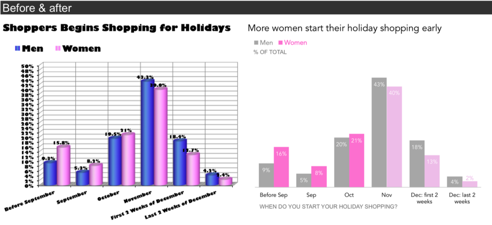
Highlight only relevant data on your story. Not everything we know should be displayed on visualisation. Then, we can use attributes that can be caught by humans before they are looked at carefully, which are also known as pre-attentive attributes. It includes a selection of shapes, colour differentiations, and clutter removal.

An example of how a visualisation becomes more appealing once the important part is highlighted, unnecessary clutter is removed, and the design stays as minimal as possible.
Source: https://www.storytellingwithdata.com/blog/2017/3/29/declutter-this-graph
Give the user some space. Not every empty space should be filled with text, metrics, visualisation, or picture. Everything that we put on the slides matters for the audiences. The more things we put on slides or dashboards, then the bigger load for the user to process all of them in their mind. Keep the design as simple as possible because as minimalists say, less is more.
Then, we still need to do some sanity checks before we give our works to users. Even though we already had our data capability measured on the preparation step, always ensure the accuracy of presented data. Also, check on the completeness and clarity of every captions and legends on our visualisation. Last but not least, ensure the filters on the dashboard are working and access to view is already granted for users.
Those are the basic principles in storytelling. By applying the principles, it is hoped that sharing insights and suggestions will reach audiences more efficiently.
If you are passionate about data and want to be involved in making the future of finance accessible to businesses of all scales, let’s be part of our team. Find out more about our available vacancy on this link.
References:
[1] Visual Data Storytelling with Tableau: Story Points, Telling Compelling Data Narratives, Lindy Ryan, 2018
[2] Storytelling with Data, Cole Nussbaumer Knaflic, 2015
Author: Mifthanzi Ariana Sarashanti


